More Controls
In the following steps of the tutorial we will add some basic controls for the end users which will allow them to:
- See the song title and artist
- Enable/Disable the count-in
- Enable/Disable the metronome
- Enable/Disable the looping
- Change the zoom level
- Change the layout of the music sheet
Song Info
To show the song info we just bind some TextBlocks to the already existing Score property.
The items we add to the left StackPanel in the toolbar where we have the open file button.
<TextBlock FontWeight="Bold" Text="{Binding Score.Title}" />
<TextBlock>-</TextBlock>
<TextBlock Text="{Binding Score.Artist}" />
Count-In
The count-in will become relevant when we activate the player in the next step, but we can already create the control which will set the count-in volume based on the toggle button state. This button we add to the right StackPanel in the toolbar.
- New XAML
- New C#
<ToggleButton IsChecked="{Binding IsCountInActive}">
    <sharp:IconBlock Icon="HourglassHalf" />
</ToggleButton>
private bool _isCountInActive;
public bool IsCountInActive
{
    get => _isCountInActive;
    set
    {
        if (value == _isCountInActive) return;
        _isCountInActive = value;
        OnPropertyChanged();
        if (AlphaTab.Api != null)
        {
            AlphaTab.Api.CountInVolume = value ? 1 : 0;
        }
    }
}
Metronome
The metronome will become relevant when we activate the player in the next step, but we can already create the control which will set the metronome volume based on the toggle button state. This button we add to the right StackPanel in the toolbar.
- New XAML
- New C#
<ToggleButton IsChecked="{Binding IsMetronomeActive}">
    <sharp:IconBlock Icon="Edit" />
</ToggleButton>
private bool _isMetronomeActive;
public bool IsMetronomeActive
{
    get => _isMetronomeActive;
    set
    {
        if (value == _isMetronomeActive) return;
        _isMetronomeActive = value;
        OnPropertyChanged();
        if (AlphaTab.Api != null)
        {
            AlphaTab.Api.MetronomeVolume = value ? 1 : 0;
        }
    }
}
Looping
The looping is similar to the metronome. We will set the IsLooping option on the API.
It also will only be relevant once we have the player feature enabled:
- New XAML
- New C#
The button goes right beside the metronome button.
<ToggleButton IsChecked="{Binding IsLooping}">
    <sharp:IconBlock Icon="Retweet" />
</ToggleButton>
private bool _isLooping;
public bool IsLooping
{
    get => _isLooping;
    set
    {
        if (value == _isLooping) return;
        _isLooping = value;
        OnPropertyChanged();
        if (AlphaTab.Api != null)
        {
            AlphaTab.Api.IsLooping = value;
        }
    }
}
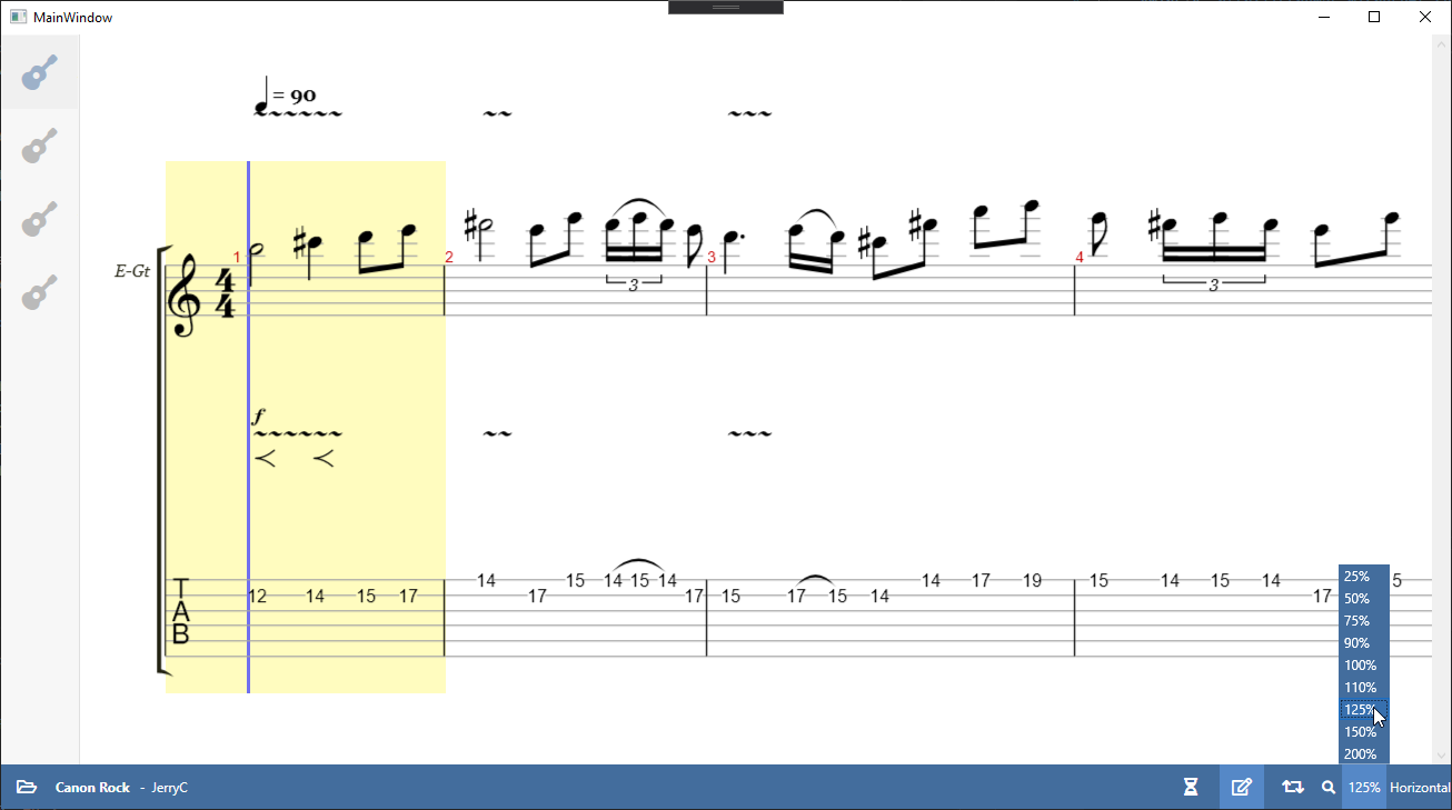
Zoom
As alphaTab can change the scale in which the music sheet is rendered, we offer the user a ComboBox to change this scale. As the default ComboBox style does not fit our application style, we modify it a bit with a custom style and template. This style can be added to the resources where already adjust the stlyes of the buttons. The combobox and icon we add after the looping button.
- New XAML
- New C#
<Style TargetType="ComboBox">
    <Setter Property="Background" Value="#436d9d" />
    <Setter Property="Foreground" Value="White" />
    <Setter Property="Template">
        <Setter.Value>
            <ControlTemplate TargetType="ComboBox">
                <Grid>
                    <ToggleButton
                        Name="ToggleButton"
                        ClickMode="Press"
                        Focusable="False"
                        IsChecked="{Binding Path=IsDropDownOpen, RelativeSource={RelativeSource TemplatedParent}, Mode=TwoWay}">
                        <ToggleButton.Template>
                            <ControlTemplate TargetType="ToggleButton">
                                <Border Name="Border" Background="Transparent" />
                                <ControlTemplate.Triggers>
                                    <Trigger Property="ToggleButton.IsChecked" Value="True">
                                        <Setter TargetName="Border" Property="Background" Value="#5588c7" />
                                    </Trigger>
                                </ControlTemplate.Triggers>
                            </ControlTemplate>
                        </ToggleButton.Template>
                    </ToggleButton>

                    <ContentPresenter
                        Name="ContentSite"
                        HorizontalAlignment="Center"
                        VerticalAlignment="Center"
                        Content="{TemplateBinding SelectionBoxItem}"
                        ContentTemplate="{TemplateBinding SelectionBoxItemTemplate}"
                        ContentTemplateSelector="{TemplateBinding ItemTemplateSelector}"
                        IsHitTestVisible="False" />

                    <TextBox
                        Name="PART_EditableTextBox"
                        Padding="{TemplateBinding Padding}"
                        HorizontalAlignment="Center"
                        VerticalAlignment="Center"
                        Background="Transparent"
                        Focusable="True"
                        IsReadOnly="{TemplateBinding IsReadOnly}"
                        Visibility="Hidden" />

                    <Popup
                        Name="Popup"
                        AllowsTransparency="True"
                        Focusable="False"
                        IsOpen="{TemplateBinding IsDropDownOpen}"
                        Placement="Top"
                        PopupAnimation="Slide">
                        <Grid
                            Name="DropDown"
                            MinWidth="{TemplateBinding ActualWidth}"
                            MaxHeight="{TemplateBinding MaxDropDownHeight}"
                            SnapsToDevicePixels="True">
                            <Border
                                Name="DropDownBorder"
                                Background="{TemplateBinding Background}"
                                CornerRadius="0" />
                            <ScrollViewer SnapsToDevicePixels="True">
                                <ItemsPresenter KeyboardNavigation.DirectionalNavigation="Contained" />
                            </ScrollViewer>
                        </Grid>
                    </Popup>
                </Grid>
            </ControlTemplate>
        </Setter.Value>
    </Setter>
</Style>
...
<sharp:IconBlock Icon="Search" />
<ComboBox
    ItemStringFormat="{}{0:P0}"
    ItemsSource="{Binding ZoomLevels}"
    SelectedItem="{Binding CurrentZoomLevel}" />
public double[] ZoomLevels { get; } =
{
    0.25,
    0.5,
    0.75,
    0.9,
    1.0,
    1.1,
    1.25,
    1.5,
    2
};

private double _currentZoomLevel;
public double CurrentZoomLevel
{
    get => _currentZoomLevel;
    set
    {
        if (value.Equals(_currentZoomLevel)) return;
        _currentZoomLevel = value;
        OnPropertyChanged();

        AlphaTab.Settings.Display.Scale = value;
        if (AlphaTab.Api != null)
        {
            AlphaTab.Api.UpdateSettings();
            AlphaTab.RenderTracks();
        }
    }
}
Updating the zoom level is a bit more effort than the previous tasks but still not very complicated:
First we fill the settings with the new scale. Then we tell alphaTab to read this updated settings
and re-render the music sheet.
Layout
alphaTab can either render the music sheet in a page-like fashion that grows from top to bottom along the available width. Or it can show the music sheet in a horizontal scrolling fashion.
These options are also offered to the user via another ComboBox. To actually apply the user selection we will again just fill the user input into the settings object and trigger an update just like for the zoom level:
- New XAML
- New C#
<ComboBox
    ItemStringFormat="{}{0}"
    ItemsSource="{Binding LayoutModes}"
    SelectedItem="{Binding CurrentLayoutMode}" />
public LayoutMode[] LayoutModes { get; } = new[]
{
    LayoutMode.Page,
    LayoutMode.Horizontal
};

private LayoutMode _currentLayoutMode;
public LayoutMode CurrentLayoutMode
{
    get => _currentLayoutMode;
    set
    {
        if (value == _currentLayoutMode) return;
        _currentLayoutMode = value;
        OnPropertyChanged();
        AlphaTab.Settings.Display.LayoutMode = value;
        if (AlphaTab.Api != null)
        {
            AlphaTab.Api.UpdateSettings();
            AlphaTab.RenderTracks();
        }
    }
}
Final Files
- MainWindow.xaml
- MainWindow.xaml.cs
<Window
x:Class="AlphaTabTutorial.MainWindow"
xmlns="http://schemas.microsoft.com/winfx/2006/xaml/presentation"
xmlns:x="http://schemas.microsoft.com/winfx/2006/xaml"
xmlns:d="http://schemas.microsoft.com/expression/blend/2008"
xmlns:fa="http://schemas.awesome.incremented/wpf/xaml/fontawesome.sharp"
xmlns:local="clr-namespace:AlphaTabTutorial"
xmlns:mc="http://schemas.openxmlformats.org/markup-compatibility/2006"
xmlns:wpf="clr-namespace:AlphaTab.Wpf;assembly=AlphaTab.Windows"
Title="MainWindow"
Width="800"
Height="450"
d:DataContext="{d:DesignInstance local:MainWindow}"
mc:Ignorable="d">
<Grid>
<Grid.RowDefinitions>
<RowDefinition Height="*" />
<RowDefinition Height="Auto" />
</Grid.RowDefinitions>
<Canvas>
<Border
Canvas.Left="0"
Canvas.Top="0"
Width="{Binding RelativeSource={RelativeSource AncestorType=Canvas}, Path=ActualWidth}"
Height="{Binding RelativeSource={RelativeSource AncestorType=Canvas}, Path=ActualHeight}"
Padding="70,0,0,0">
<wpf:AlphaTab x:Name="AlphaTab" Loaded="OnAlphaTabLoaded" />
</Border>
<Border
Canvas.Left="0"
Canvas.Top="0"
Height="{Binding RelativeSource={RelativeSource AncestorType=Canvas}, Path=ActualHeight}"
MinWidth="70"
VerticalAlignment="Stretch"
Background="#f7f7f7"
BorderBrush="#1f000000"
BorderThickness="0,0,1,0"
ClipToBounds="False">
<Border.Resources>
<Style TargetType="ListBox">
<Setter Property="SelectionMode" Value="Single" />
<Setter Property="Background" Value="Transparent" />
<Setter Property="BorderThickness" Value="0" />
<Setter Property="Padding" Value="0" />
<Setter Property="MinWidth" Value="70" />
<Setter Property="ScrollViewer.HorizontalScrollBarVisibility" Value="Hidden" />
<Style.Triggers>
<Trigger Property="IsMouseOver" Value="False">
<Setter Property="MaxWidth" Value="70" />
</Trigger>
</Style.Triggers>
</Style>
<Style TargetType="ListBoxItem">
<Setter Property="Background" Value="Transparent" />
<Setter Property="BorderThickness" Value="0" />
<Setter Property="Margin" Value="0" />
<Style.Triggers>
<Trigger Property="IsSelected" Value="True">
<Setter Property="Background" Value="#08000000" />
<Setter Property="fa:IconBlock.Foreground" Value="#4972a1" />
<Setter Property="fa:IconBlock.Opacity" Value="1" />
</Trigger>
<Trigger Property="IsSelected" Value="False">
<Setter Property="fa:IconBlock.Opacity" Value="0.5" />
</Trigger>
<Trigger Property="IsMouseOver" Value="True">
<Setter Property="Background" Value="#1a000000" />
<Setter Property="fa:IconBlock.Opacity" Value="1" />
</Trigger>
</Style.Triggers>
</Style>
</Border.Resources>
<ListBox ItemsSource="{Binding Score.Tracks}" SelectedItem="{Binding SelectedTrack}">
<ListBox.ItemTemplate>
<ItemContainerTemplate DataType="model:Track">
<Grid Height="64">
<Grid.ColumnDefinitions>
<ColumnDefinition Width="64" />
<ColumnDefinition Width="*" />
</Grid.ColumnDefinitions>
<fa:IconBlock
Grid.Column="0"
Margin="0,0,5,0"
HorizontalAlignment="Center"
VerticalAlignment="Center"
FontSize="32px"
Icon="Guitar"
Opacity="0.5" />
<TextBlock
Grid.Column="1"
VerticalAlignment="Center"
FontWeight="Bold"
Text="{Binding Name}" />
</Grid>
</ItemContainerTemplate>
</ListBox.ItemTemplate>
</ListBox>
</Border>
</Canvas>
<Grid
Grid.Row="1"
Grid.Column="0"
Background="#436d9d">
<Grid.Resources>
<Style x:Key="ToolbarButtonBaseStyle" TargetType="ButtonBase">
<Setter Property="BorderThickness" Value="0" />
<Setter Property="Background" Value="Transparent" />
<Setter Property="Foreground" Value="White" />
<Setter Property="FontSize" Value="16px" />
<Setter Property="Padding" Value="4" />
<Setter Property="Margin" Value="3,0" />
<Setter Property="Width" Value="40" />
<Setter Property="Height" Value="40" />
<Setter Property="Cursor" Value="{x:Static Cursors.Hand}" />
<Setter Property="Template">
<Setter.Value>
<ControlTemplate TargetType="{x:Type ButtonBase}">
<Border
Name="Chrome"
Background="{TemplateBinding Background}"
BorderBrush="{TemplateBinding BorderBrush}"
SnapsToDevicePixels="true">
<ContentPresenter
Margin="{TemplateBinding Padding}"
HorizontalAlignment="{TemplateBinding HorizontalContentAlignment}"
VerticalAlignment="{TemplateBinding VerticalContentAlignment}"
RecognizesAccessKey="True"
SnapsToDevicePixels="{TemplateBinding SnapsToDevicePixels}" />
</Border>
</ControlTemplate>
</Setter.Value>
</Setter>
</Style>
<Style BasedOn="{StaticResource ToolbarButtonBaseStyle}" TargetType="Button" />
<Style BasedOn="{StaticResource ToolbarButtonBaseStyle}" TargetType="ToggleButton">
<Style.Triggers>
<Trigger Property="IsChecked" Value="True">
<Setter Property="Background" Value="#5588c7" />
</Trigger>
</Style.Triggers>
</Style>
<Style TargetType="TextBlock">
<Setter Property="Foreground" Value="White" />
<Setter Property="Margin" Value="3,0" />
<Setter Property="VerticalAlignment" Value="Center" />
</Style>
<Style TargetType="fa:IconBlock">
<Setter Property="Foreground" Value="White" />
<Setter Property="Margin" Value="3,0" />
<Setter Property="VerticalAlignment" Value="Center" />
</Style>
<Style TargetType="ComboBox">
<Setter Property="Background" Value="#436d9d" />
<Setter Property="Foreground" Value="White" />
<Setter Property="Template">
<Setter.Value>
<ControlTemplate TargetType="ComboBox">
<Grid>
<ToggleButton
Name="ToggleButton"
ClickMode="Press"
Focusable="False"
IsChecked="{Binding Path=IsDropDownOpen, RelativeSource={RelativeSource TemplatedParent}, Mode=TwoWay}">
<ToggleButton.Template>
<ControlTemplate TargetType="ToggleButton">
<Border Name="Border" Background="Transparent" />
<ControlTemplate.Triggers>
<Trigger Property="ToggleButton.IsChecked" Value="True">
<Setter TargetName="Border" Property="Background" Value="#5588c7" />
</Trigger>
</ControlTemplate.Triggers>
</ControlTemplate>
</ToggleButton.Template>
</ToggleButton>
<ContentPresenter
Name="ContentSite"
HorizontalAlignment="Center"
VerticalAlignment="Center"
Content="{TemplateBinding SelectionBoxItem}"
ContentTemplate="{TemplateBinding SelectionBoxItemTemplate}"
ContentTemplateSelector="{TemplateBinding ItemTemplateSelector}"
IsHitTestVisible="False" />
<TextBox
Name="PART_EditableTextBox"
Padding="{TemplateBinding Padding}"
HorizontalAlignment="Center"
VerticalAlignment="Center"
Background="Transparent"
Focusable="True"
IsReadOnly="{TemplateBinding IsReadOnly}"
Visibility="Hidden" />
<Popup
Name="Popup"
AllowsTransparency="True"
Focusable="False"
IsOpen="{TemplateBinding IsDropDownOpen}"
Placement="Top"
PopupAnimation="Slide">
<Grid
Name="DropDown"
MinWidth="{TemplateBinding ActualWidth}"
MaxHeight="{TemplateBinding MaxDropDownHeight}"
SnapsToDevicePixels="True">
<Border
Name="DropDownBorder"
Background="{TemplateBinding Background}"
CornerRadius="0" />
<ScrollViewer SnapsToDevicePixels="True">
<ItemsPresenter KeyboardNavigation.DirectionalNavigation="Contained" />
</ScrollViewer>
</Grid>
</Popup>
</Grid>
</ControlTemplate>
</Setter.Value>
</Setter>
</Style>
</Grid.Resources>
<Grid.ColumnDefinitions>
<ColumnDefinition Width="*" />
<ColumnDefinition Width="*" />
</Grid.ColumnDefinitions>
<StackPanel
Grid.Row="0"
Grid.Column="0"
Orientation="Horizontal">
<Button Click="OnOpenClick">
<fa:IconBlock Icon="FolderOpen" />
</Button>
<TextBlock FontWeight="Bold" Text="{Binding Score.Title}" />
<TextBlock>-</TextBlock>
<TextBlock Text="{Binding Score.Artist}" />
</StackPanel>
<StackPanel
Grid.Row="0"
Grid.Column="1"
HorizontalAlignment="Right"
Orientation="Horizontal">
<ToggleButton IsChecked="{Binding IsCountInActive}">
<fa:IconBlock Icon="HourglassHalf" />
</ToggleButton>
<ToggleButton IsChecked="{Binding IsMetronomeActive}">
<fa:IconBlock Icon="Edit" />
</ToggleButton>
<ToggleButton IsChecked="{Binding IsLooping}">
<fa:IconBlock Icon="Retweet" />
</ToggleButton>
<fa:IconBlock Icon="Search" />
<ComboBox
ItemStringFormat="{}{0:P0}"
ItemsSource="{Binding ZoomLevels}"
SelectedItem="{Binding CurrentZoomLevel}" />
<ComboBox
ItemStringFormat="{}{0}"
ItemsSource="{Binding LayoutModes}"
SelectedItem="{Binding CurrentLayoutMode}" />
</StackPanel>
</Grid>
<Grid
Grid.Row="0"
Grid.RowSpan="2"
Visibility="{Binding LoadingIndicatorVisibility}">
<Border Background="#80000000" />
<Border
Margin="0,20,0,0"
Padding="10"
HorizontalAlignment="Center"
VerticalAlignment="Top"
Background="White">
<Border.Effect>
<DropShadowEffect
BlurRadius="10"
Direction="-90"
Opacity="0.3" />
</Border.Effect>
<TextBlock>
Music sheet is loading
</TextBlock>
</Border>
</Grid>
</Grid>
</Window>
using System;
using System.ComponentModel;
using System.IO;
using System.Runtime.CompilerServices;
using System.Windows;
using AlphaTab;
using AlphaTab.Importer;
using AlphaTab.Model;
using Microsoft.Win32;

namespace AlphaTabTutorial
{
    public partial class MainWindow : INotifyPropertyChanged
    {
        private Score _score;
        private Track _selectedTrack;

        public Score Score
        {
            get => _score;
            set
            {
                if (Equals(value, _score)) return;
                _score = value;
                OnPropertyChanged();
                SelectedTrack = _score.Tracks[0];
            }
        }

        public Track SelectedTrack
        {
            get => _selectedTrack;
            set
            {
                if (Equals(value, _selectedTrack)) return;
                _selectedTrack = value;
                OnPropertyChanged();
                AlphaTab.Tracks = new[]
                {
                    value
                };
                AlphaTab.RenderTracks();
            }
        }

        private Visibility _loadingIndicatorVisibility = Visibility.Collapsed;
        public Visibility LoadingIndicatorVisibility
        {
            get => _loadingIndicatorVisibility;
            set
            {
                if (value == _loadingIndicatorVisibility) return;
                _loadingIndicatorVisibility = value;
                OnPropertyChanged();
            }
        }

        private bool _isCountInActive;
        public bool IsCountInActive
        {
            get => _isCountInActive;
            set
            {
                if (value == _isCountInActive) return;
                _isCountInActive = value;
                OnPropertyChanged();
                if (AlphaTab.Api != null)
                {
                    AlphaTab.Api.CountInVolume = value ? 1 : 0;
                }
            }
        }

        private bool _isMetronomeActive;
        public bool IsMetronomeActive
        {
            get => _isMetronomeActive;
            set
            {
                if (value == _isMetronomeActive) return;
                _isMetronomeActive = value;
                OnPropertyChanged();
                if (AlphaTab.Api != null)
                {
                    AlphaTab.Api.MetronomeVolume = value ? 1 : 0;
                }
            }
        }

        public double[] ZoomLevels { get; } =
        {
            0.25,
            0.5,
            0.75,
            0.9,
            1.0,
            1.1,
            1.25,
            1.5,
            2
        };

        private double _currentZoomLevel = 1.0;
        public double CurrentZoomLevel
        {
            get => _currentZoomLevel;
            set
            {
                if (value.Equals(_currentZoomLevel)) return;
                _currentZoomLevel = value;
                OnPropertyChanged();

                AlphaTab.Settings.Display.Scale = value;
                if (AlphaTab.Api != null)
                {
                    AlphaTab.Api.UpdateSettings();
                    AlphaTab.RenderTracks();
                }
            }
        }

        public LayoutMode[] LayoutModes { get; } = new[]
        {
            LayoutMode.Page,
            LayoutMode.Horizontal
        };

        private LayoutMode _currentLayoutMode;
        public LayoutMode CurrentLayoutMode
        {
            get => _currentLayoutMode;
            set
            {
                if (value == _currentLayoutMode) return;
                _currentLayoutMode = value;
                OnPropertyChanged();
                AlphaTab.Settings.Display.LayoutMode = value;
                if (AlphaTab.Api != null)
                {
                    AlphaTab.Api.UpdateSettings();
                    AlphaTab.RenderTracks();
                }
            }
        }


        public MainWindow()
        {
            InitializeComponent();
            DataContext = this;
        }

        private void OnAlphaTabLoaded(object sender, RoutedEventArgs e)
        {
            AlphaTab.Api.RenderStarted.On(e =>
            {
                LoadingIndicatorVisibility = Visibility.Visible;
            });

            AlphaTab.Api.RenderFinished.On(e =>
            {
                LoadingIndicatorVisibility = Visibility.Collapsed;
            });
        }

        private void OnOpenClick(object sender, RoutedEventArgs e)
        {
            var dialog = new OpenFileDialog
            {
                Filter = "Supported Files (*.gp3, *.gp4, *.gp5, *.gpx, *.gp)|*.gp3;*.gp4;*.gp5;*.gpx;*.gp"
            };
            if (dialog.ShowDialog().GetValueOrDefault())
            {
                OpenFile(dialog.FileName);
            }
        }

        private void OpenFile(string fileName)
        {
            try
            {
                Score = ScoreLoader.LoadScoreFromBytes(File.ReadAllBytes(fileName));
            }
            catch (Exception e)
            {
                MessageBox.Show("Failed to open file: " + e.Message);
            }
        }

        public event PropertyChangedEventHandler PropertyChanged;
        protected virtual void OnPropertyChanged([CallerMemberName] string propertyName = null)
        {
            PropertyChanged?.Invoke(this, new PropertyChangedEventArgs(propertyName));
        }
    }
}